

The Context: Melbourne’s Need for a Unified City Identity
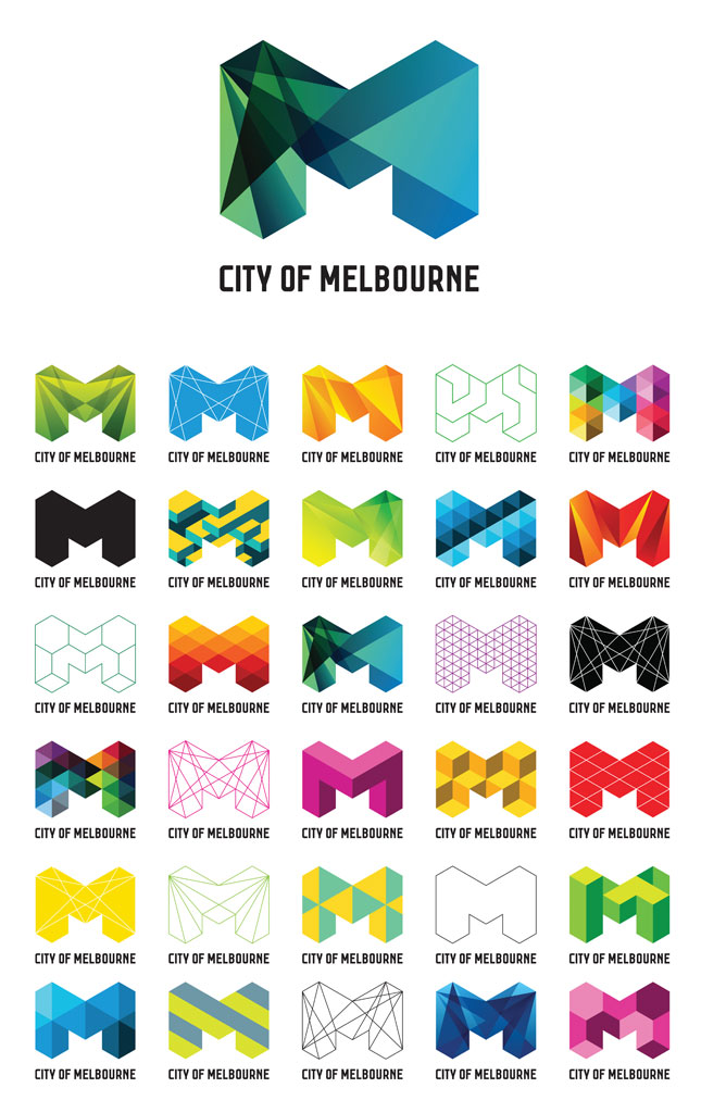
Melbourne has long been Australia’s cultural capital. Known for its thriving arts scene, world-class events, and dynamic food and coffee culture, the city enjoys a reputation as a melting pot of creativity and innovation.
However, by the late 2000s, Melbourne lacked a cohesive brand identity to reflect this vibrancy and communicate its essence to the world.
Tourism and business efforts were fragmented, with no singular message tying the city’s attractions, industries, and ethos together.
Compounding this was Melbourne’s competition with Sydney, whose iconic landmarks—the Opera House and Harbour Bridge—gave it instant visual recognition. Melbourne needed a strategy to unify its offerings under a single, compelling identity.
Enter Landor Associates, a global leader in branding, tasked with creating a brand that would encapsulate Melbourne’s spirit while standing out on the global stage.
The Creation of the “M” Logo
1. The Design Philosophy
Landor’s team approached the project with a deep understanding of Melbourne’s multifaceted identity. The city isn’t just one thing—it’s a kaleidoscope of experiences, from its laneway street art to its prestigious Melbourne International Comedy Festival, from its sporting events like the Australian Open to its role as a global education hub.
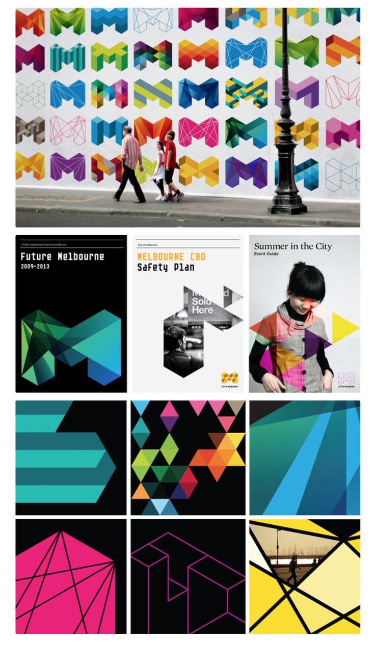
The “M” was designed to be as versatile as the city itself. The letter, formed by a series of interlocking triangles, acts as a blank canvas, capable of changing colors, textures, and patterns depending on the context. This adaptability ensured the logo could represent Melbourne’s diverse attributes without losing its core identity.
2. The Visual Language
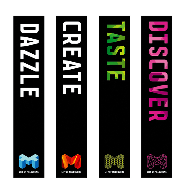
The geometric design of the “M” was deliberately modern and minimalist, exuding confidence and sophistication. Each variation of the logo carried a unique visual story—whether it was bright and playful for arts campaigns, sleek and corporate for business events, or nature-inspired for sustainability initiatives.
This modular approach allowed Melbourne to speak to different audiences without diluting its overarching brand. Whether projected on the side of a skyscraper, printed on a tram, or animated for digital campaigns, the logo remained instantly recognizable.
Why Melbourne’s “M” Worked: Key Takeaways
It Captured the Spirit of the City
Melbourne’s brand isn’t built on a singular landmark or historical narrative; it’s built on an attitude—one of creativity, inclusion, and constant reinvention.
The “M” logo reflected this ethos, acting as a metaphor for the city’s dynamic personality.
Adaptability as a Strength
In the modern branding landscape, rigidity is a liability.
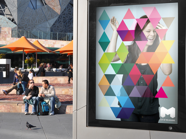
The “M” demonstrated how a brand can maintain consistency while offering flexibility.
Its ability to transform while staying true to its form mirrored Melbourne’s ability to cater to a wide range of interests and audiences.
Engagement with Stakeholders
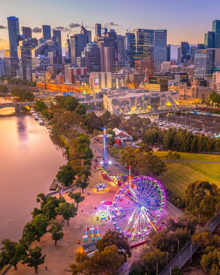
The success of Melbourne’s city branding didn’t happen in isolation.
The city’s government, tourism boards, and business leaders embraced the new identity wholeheartedly.
This collective buy-in ensured that the logo wasn’t just a design but a tool actively used across all sectors.
Lessons for Cities and Organizations
The success of Melbourne’s “M” offers invaluable insights for cities and organizations that aim to build impactful brands. Here’s how PDF Africa can adapt these lessons to elevate your destination brand:
Understand Your Identity
Every place has a unique story. For PDF Africa, the first step is identifying what makes your place (town, community, village, city and region) distinctive. Is it innovation, cultural diversity, natural beauty, or something else? A brand must reflect the authentic essence of the place it represents.
Create a Flexible Identity
A static logo won’t capture the complexities of modern cities or organizations. Like Melbourne’s “M,” PDF Africa as your place development partner will consider a dynamic visual system that can adapt to various contexts—whether promoting sustainability projects, cultural festivals, or business summits.
Engage Stakeholders Early
Collaboration is key. Melbourne’s success was built on the participation of government agencies, businesses, and residents. Similarly, PDF Africa will mobilize all stakeholders in the branding process to ensure buy-in and alignment.
Prioritize Visual Appeal
In today’s digital world, visuals are often the first point of contact. Invest in a design that works seamlessly across platforms, from billboards to social media. The goal is to create something instantly recognizable and shareable.
Think Long-Term
Melbourne’s branding wasn’t a short-term campaign; it was a long-term investment. PDF Africa as your place branding advisor will aim for a brand that can evolve over decades, adapting to new challenges and opportunities while maintaining its core identity.
Boosting Tourism
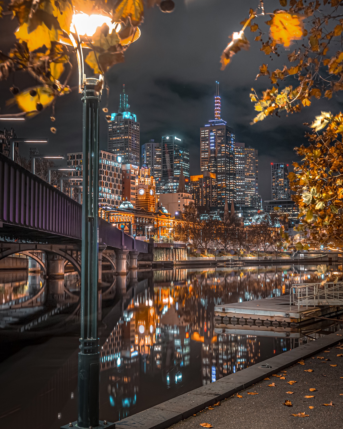
Melbourne became synonymous with creativity and culture, attracting millions of visitors each year.
Events like the Melbourne Food and Wine Festival and the Formula 1 Australian Grand Prix used the branding to amplify their appeal, creating a unified and recognizable narrative for the city.

Attracting Global Talent
The logo wasn’t just about attracting tourists; it positioned Melbourne as a desirable place to live, work, and study.
With its strong association with innovation and inclusivity, the brand appealed to global talent, particularly in education and tech industries.
Enhancing Local Pride
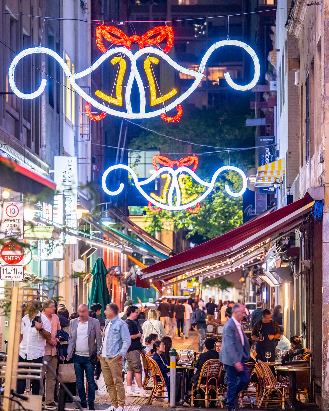
A successful city brand doesn’t just market to outsiders; it resonates with residents.
The “M” logo became a badge of honor for Melburnians, reinforcing their identity as part of a forward-thinking, creative community.
Embrace Technology
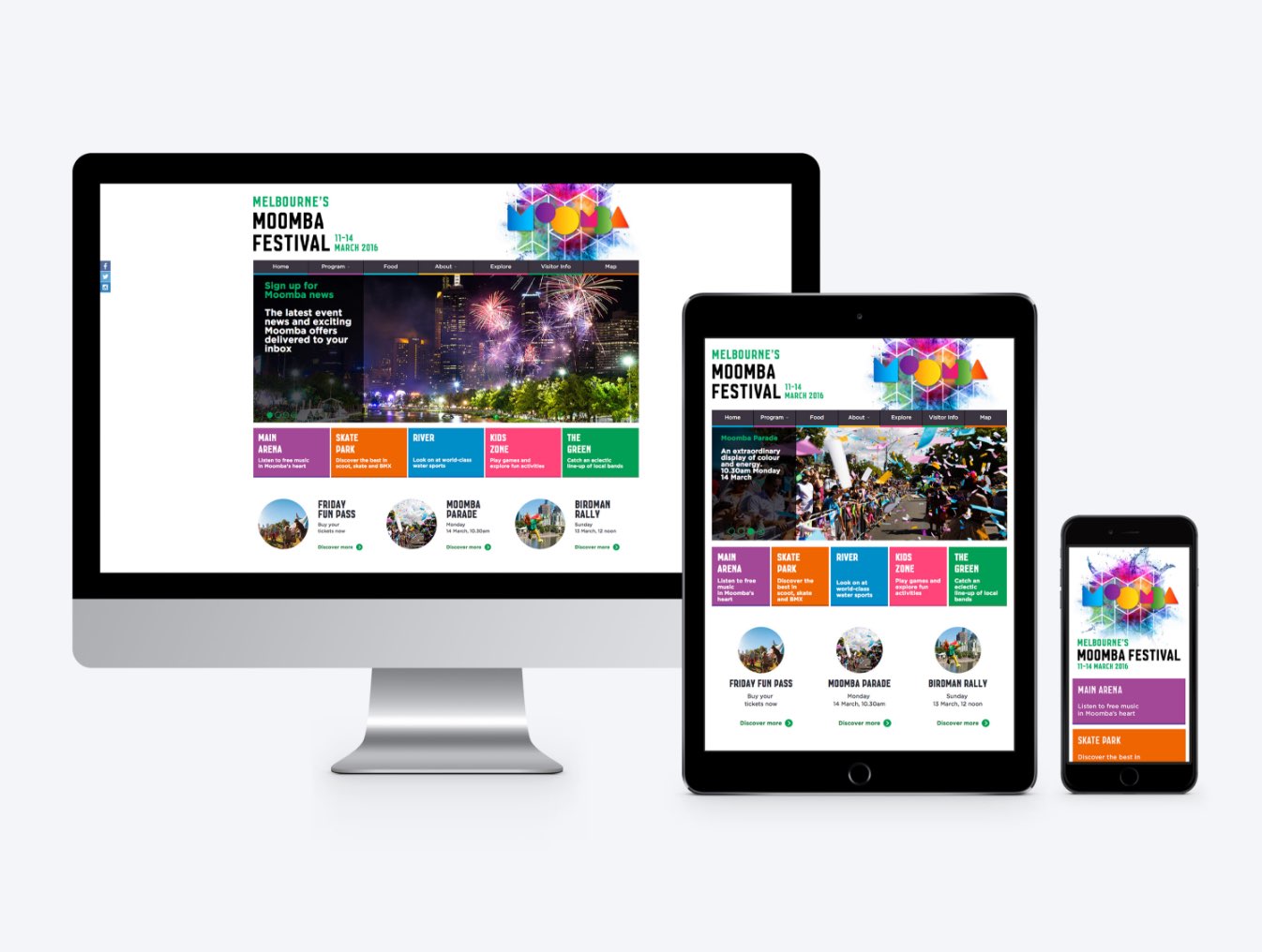
Digital tools offer unprecedented opportunities for engagement.
Augmented reality, social media campaigns, and data analytics can help cities and organizations create personalized, immersive brand experiences.
Foster Inclusivity
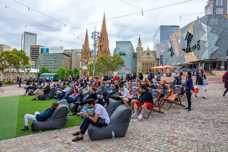
Place brands should speak to everyone—residents, visitors, and investors alike.
By involving diverse voices in the branding process, cities can create identities that resonate broadly.
Stay Authentic

Authenticity remains the cornerstone of effective branding. Melbourne’s “M” worked because it genuinely reflected the city’s spirit.
Any attempt to replicate its success must start with an honest exploration of identity.