
The Context: New York in Crisis
Initially a response to NYC’s economic and image crisis, it combined a simple, universally understood message with emotional resonance.
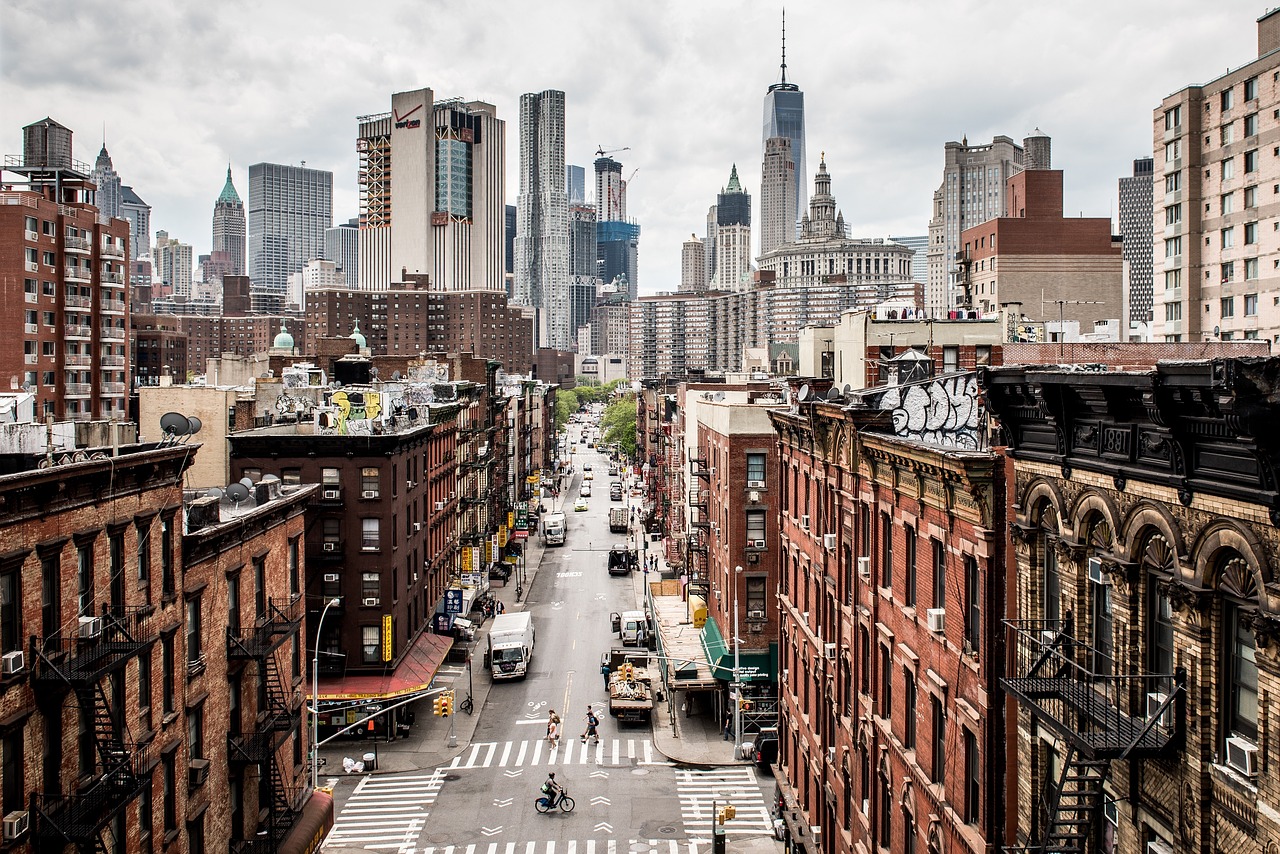
In the mid-1970s, New York City was at rock bottom. The city faced fiscal bankruptcy, widespread crime, and declining tourism. The once-glamorous image of NYC had been replaced by fears of danger and decay. Headlines declared the city “ungovernable,” and its prospects for revival looked bleak.
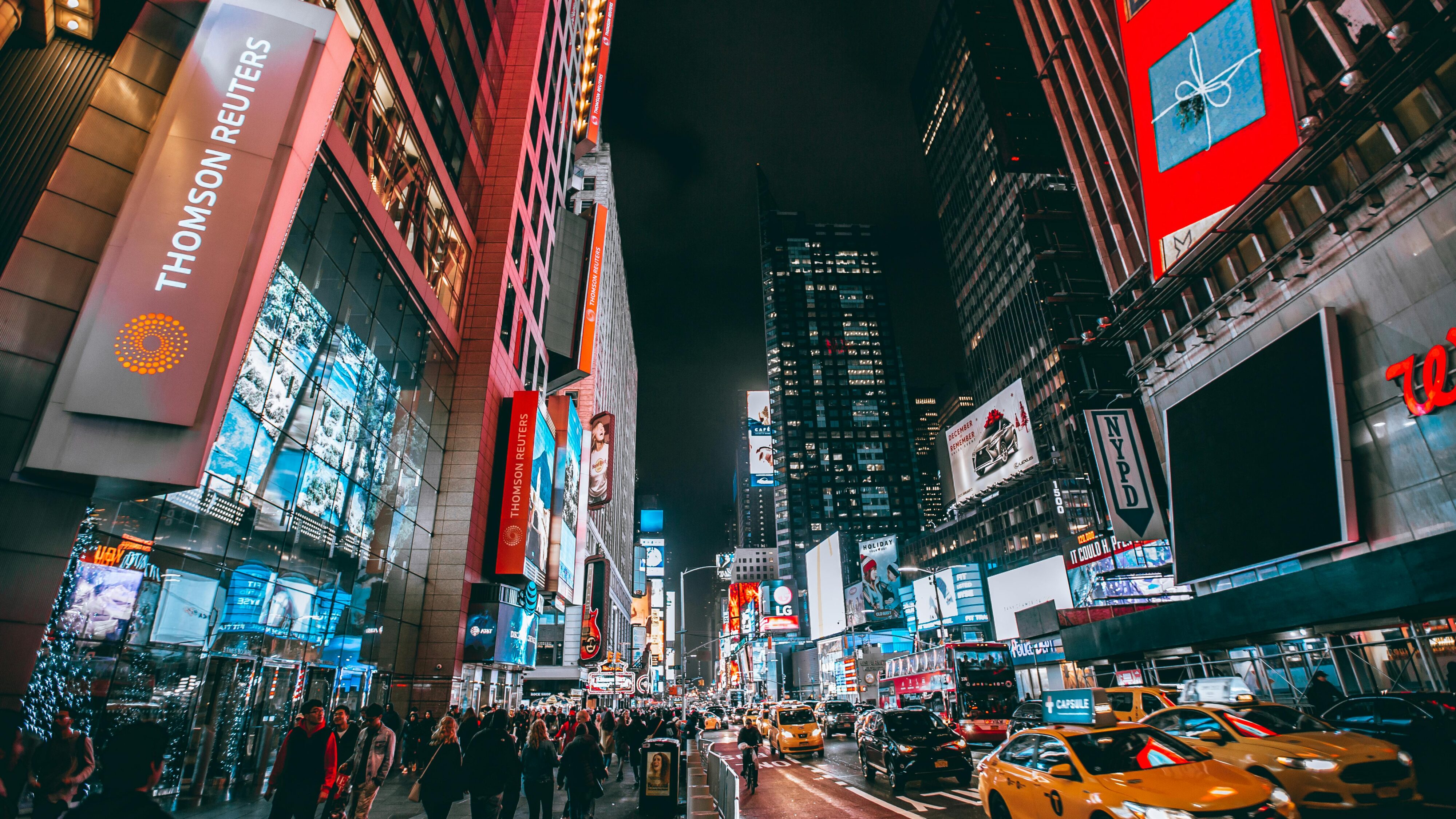
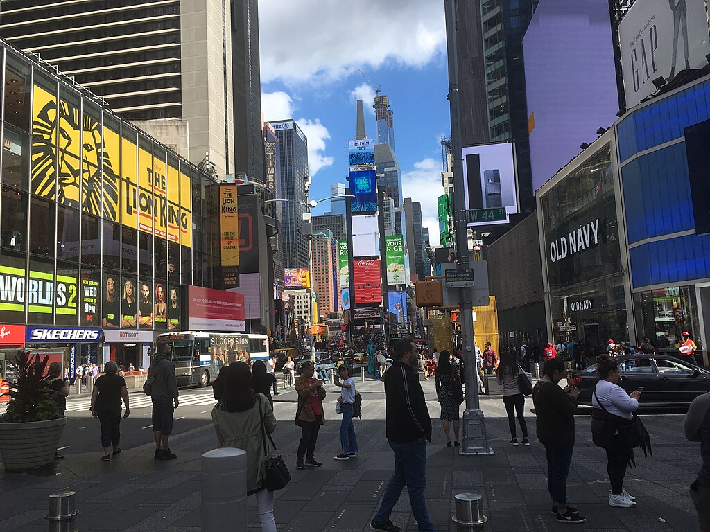
Tourism, a vital economic pillar, had taken a massive hit. With iconic attractions like Times Square marred by illicit activity and subways perceived as unsafe, potential visitors stayed away. The city needed more than just financial aid—it required a complete overhaul of its image to inspire confidence and attract both tourists and investors.
The Birth of “I ♥ NY”

Over decades, New York City has layered campaigns emphasizing diversity, resilience, and global appeal, like “This is New York City” and “The Official Guide to NYC,” ensuring its brand evolves with the times.
Realizing the gravity of the situation, New York State officials enlisted the advertising agency Wells Rich Greene and the legendary graphic designer Milton Glaser. The objective was straightforward but ambitious: create a campaign that would rejuvenate the city’s appeal and bring back tourism dollars.
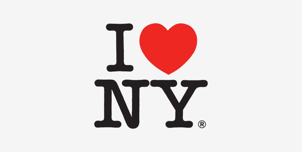
Milton Glaser’s design—a simple, bold “I ♥ NY” rendered in a rounded slab serif typeface—was both unpretentious and striking. The symbol, with its heart replacing the word “love,” conveyed warmth, affection, and emotional resonance. The campaign’s jingle, performed by Broadway stars, added an auditory charm, amplifying its appeal across mediums.
Crucially, the slogan wasn’t just about the physical city; it encapsulated the feeling of being in New York. It connected with both residents and visitors, sparking pride in locals and curiosity in potential tourists.
Why “I ♥ NY” Worked: The Anatomy of Success
Simplicity and Emotional Resonance
At its core, “I ♥ NY” was disarmingly simple. Its brevity and universal message allowed it to cut through the noise, delivering an emotional punch that resonated across demographics.
Unlike many tourism campaigns focused solely on attractions, this campaign focused on the relationship people had—or could have—with the city.
Love is a universal emotion, and “I ♥ NY” tapped into this instinctual human connection.
Whether you were a first-time visitor or a lifelong New Yorker, the slogan invited you to feel something personal about the city.
Authenticity and Community Involvement
Unlike campaigns that felt imposed or artificial, “I ♥ NY” grew roots in the community.
New Yorkers, initially skeptical of marketing ploys, embraced the campaign as their own. It didn’t feel like a message to the city—it felt like a message from the city.
This authenticity helped bridge the gap between New Yorkers and the millions of visitors who came to experience the city.
The campaign wasn’t just about tourism dollars; it was about creating a sense of shared ownership and identity.
Visual Appeal and Versatility
Milton Glaser’s design wasn’t just memorable; it was endlessly adaptable. The logo appeared on posters, T-shirts, and merchandise of all kinds, spreading like wildfire.
Its clean, modular design made it easy to reproduce and reinterpret, ensuring its longevity in the public consciousness.
The flexibility of the logo also allowed it to evolve with the city’s needs.
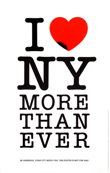
Decades later, after the 9/11 attacks, the campaign adapted to include a poignant blackened heart in solidarity and mourning. This ability to reflect the city’s spirit in moments of triumph and tragedy has cemented its relevance.
Lessons for the Future of Place Branding
As cities around the world face challenges ranging from climate change to over-tourism, the principles behind “I ♥ NY” remain more relevant than ever.
1. Focus on Emotional Connections
Successful place brands are built on feelings, not just facts. A city’s story should evoke pride, curiosity, and a sense of belonging.
2. Embrace Adaptability
Brands must evolve with the times, reflecting both the triumphs and challenges of their cities. The ability to adapt while staying true to core values is essential for longevity.
3. Engage Communities
Authenticity comes from within. Place branding campaigns should involve residents as co-creators, ensuring that the message resonates both locally and globally.
4. Leverage Digital Storytelling
The digital age offers unprecedented opportunities to amplify place brands. From social media to data-driven insights, cities can craft highly targeted campaigns that reach audiences where they are.

Post-9/11 Resurgence
In the aftermath of September 11, 2001, New York faced a new kind of crisis. The city had to heal, rebuild, and reassure the world of its resilience. “I ♥ NY” returned with renewed significance. Milton Glaser modified the logo, darkening the heart and adding the words “More Than Ever.” The message wasn’t just about tourism; it was a declaration of unity and strength.
This iteration of the campaign demonstrated how a place brand could pivot to reflect current realities while maintaining its core message. It also showed how deeply embedded the campaign was in the city’s collective consciousness.

Modern Initiatives Keeping the Brand Alive
In recent years, NYC has leveraged digital platforms to keep its brand relevant. Campaigns such as “This is New York City” highlighted the city’s diversity, cultural richness, and ever-evolving character. Social media played a crucial role in spreading this message, with platforms like Instagram and TikTok turning everyday visitors into brand ambassadors.
NYC also embraced hyper-local campaigns, promoting lesser-known neighborhoods and experiences to appeal to repeat visitors and locals alike. This strategy expanded the city’s appeal beyond iconic landmarks, showcasing the multifaceted nature of life in New York.